Friday, 22 June 2012

Bibliography


Title
Brody: the graphic language of Neville Brody
Author
Publisher
Universe, 2001
ISBN
0789306530, 9780789306531


Title
Peter Blake: a retrospective
Authors
Publisher
Tate Publishing, 2007
ISBN
1854377175, 9781854377173

Title
Made with FontFont: Type for Independent Minds
Authors
Publisher
BIS, 2009
ISBN


website address:
9063691297, 9789063691295


http://jaumeplensa.com/

Date:              15.04.12

Gallery name:     Liverpool Tate gallery
Exhibition:       Alice In Wonderland
Date:              November 2011

Title
Trek: David Carson, recent work
Author
Publisher
Gingko Press, 2003
ISBN
1584230460, 9781584230465


Website         
address:         http://www.davidcarsondesign.com/
Date:              07.06.12

Evaluation

Now that I have completed my final major project I have had opportunity to look back at my original intentions and evaluate the work I have done to see what worked well and what I could have done better. I am extremely happy with the final outcome of this project and feel that I have stuck to the brief that I set myself in my proposal. Throughout this project I have come across many problems, one of the biggest problems I had was adapting my ideas to fit what was practical. I think my ideas were very ambitious for this project and required skills that at the start of the project I didn't have. However I believe I was quite successful in overcoming these problems without compromising my ideas and with the help of my tutors,I was able to develop the necessary skills.

Thursday, 21 June 2012

Exhibition Opening

Last night was the opening of the exhibition and I think the whole night was extremely successful. It was really suprising to see how professional it all looked when everything was up and finished. I was really impressed with the standard of work that was exhibited by everyone on my course and I believe that the poeple visiting it would feel the same. There was a lot of paintings in the exhibition and although they were all excellent, I was really glad that I chose to do something a bit different. I was happy to see people looking in detail at my images and to see them standing and watching the whole of my film. I really enjoyed the whole proccess of producing this exhibition and I think that all the hard work that went into making it look as good as it did definitly paid off and the exhibition looked brillient.

Monday, 18 June 2012

Putting my work into my space

Today I have been putting guy work up in my allocated space ready for the exhibition opening on Wednesday. I want to showcase my work to the best of my ability and try to get it looking as good as I possibly can. I want my canvas images to stand out from the wall a bit and so to achieve this I first of all tried attaching foam board to the back of it but this didn't work as the foam board wouldn't stick to the canvas. After some deliberation I decided have four long wooden beams nailed to the wall and then I nailed my images to that beam using big bronze nails. This was really affective and I feel that using the big nails really added to the whole effect. I was them able to put in my mac and put the finishing touches to my exhibition. I am very happy with the way my exhibition has turned out and am very proud of what I have produced.

Friday, 15 June 2012

Exhibition Space

This week we have been painting and putting cup the boards for the exhibition and today I was given my exhibition space. I have been given two boards, one has a square hole in the wall for an apple mac to be put in for my film to be shown on and the other is for me to fill with my canvas images. I am happy with this space and feel I will be able to showcase my work very well in it.

Creating my film

Today I have successfully created my film. I had a few difficulties at first as I had originally planned to project my images onto the wall and film the projection, however I found that when i projected the images they did not look like the old fashioned projections that I wanted them too. This meant that I had to figure out how to make them look like these old projections using iMovie. I imported my images onto it and played around with the lighting and dust and scratch as well as many other things until I got the film looking the way I wanted it to. I am extremely happy with the finished product and although it is something very different to what I have done in the past I think it has been very successful and I am glad I decided to try something different.

Wednesday, 13 June 2012

presentation of images success

I have come up with a way to get the images onto canvas without getting them printed. I have used image transfer in some of my experimentation and it was really successful so I have tried out this method with some of my photographs. I really like the outcome and I think that this technique give a really nice effect as it makes the image seem old and warn and this fits in really well with the theme of my work. I have used gouache paint on the images I have transferred onto the canvas to create a bit of a blur and then collaged my text onto it. I am very happy with what I have achieved and look forward to making my film and seeing it all up in my exhibition.
This is the finished images for the first line of the poem.

Saturday, 9 June 2012

How to present my work

I have been thinking about how I want to present the images I am creating in my exhibition. I know that I am going to have a film of the slide show of all the images but I also want to exhibit the actual images themselves because that way the whole poem will be up swell so the film will make a bit more sense. I know that I don't want to have the images just printed onto paper because I don't feel that will showcase them very well. I have been looking into the expenses and practicalities of having them printed onto canvases because I feel that small canvases would look really nice on the wall as well as be very easy to work onto, however I have found that it would be far too expensive to get 16 canvases printed and so I have been forced to look at alternative options.

Thursday, 7 June 2012

David Carson

After deciding on my photos for the background of my images I have been considering how I actually want to text to look on the page. I really like the way that David carson has used different sized text in this piece of graphics.
 I feel that the different sizes makes the images very interesting and it is also a really good way to emphasise certain words and make then seem more important than others. i also am very one of the way that he has made the text blur slightly. this is the kind of effect that I aim to create in my own work because I feel it gives the impression that the text is moving and this is what I am looking to achieve in my final piece.

Wednesday, 6 June 2012

Photographs successfully taken

Today I have taken a lot of photographs that I felt related to each line of the poem. I walked around Entwistle Train Station and found that a lot of the things mentioned in the poem could be found around the station, only now they are all much more modern. I really like the idea of the contrast between the old fashioned way the things were being described in the poem and the modern versions that I have photographed. I think this will make my images very interesting and will stop them being to obvious and safe.
 This image is the image I intend to use for the line 'charging along like troops in a battle'.

This is the image I intend to use for the line 'Here is a cart runaway in the road'.

Photography

Today I am going to go for a walk to take the photos that I need for the background to each line of the poem. I intend to take pictures that relate to the line it is intended for in a subtle sort of way. I feel that of all the photos that I experimented with, the one with buttercups on it worked the best with the paint overlaid on top and I think this was because their was already one section that was more in focus than the rest so when I blured part of it, it wasnt as obvious where the bluring stopped as it was in the rest of my images. I will keep this in mind when taking the photographs today and try to keep a significant forground and background in my images.

Monday, 4 June 2012

comparing and making decisions

I showed my tutor the work that I had done using paint and photography and she really liked it. She recomended that I try doing the same to the images using photoshop to get a different finish to it and then decide which I think works best. I did this and I really liked both outcomes, however I think that the paint worked slightly better, mostly because it gives a slightly less polished look and looks a bit more free. Although I do prefer the painted photographs, using photoshop gave me the opportunity to experiment with the colour and saturation of the image.
This is an example of the colour that I would use in the slides I  am producing. I prefer this kind of colour in the image than bright colours because it is a lot more subtle and looks like an old photograph which I think will go really nicely with the way I am planning on producing my final piece (old fashioned projections on the wall).

Friday, 1 June 2012

Aplying inspiration to my work

I have been using inspiration form The Kooks album cover to bring together paint and photography to see if this would be a good idea for the background for the images I am creating to represent each line of the poem. I have been using photographs that I took when I went for a walk and bluring part of the picture using paint and leaving a section of it without paint so that it is clearer than the rest of the image. I feel that this worked really well and made the whole image look as though it was moving really quickly out of sight.

Thursday, 31 May 2012

Inspiration

I have been a little bit stuck over the past few days as to how to present each line of the poem and have been looking for inspiration. It was when I was flicking through my ipod and came across The Kooks Junk of the Heart album cover that I found my inspiration.
I really like how it is partially really clear and partially painted and blured. I think that the painted area gives a really nice sence of movement and freedom and the more clear, photographed areas give the image some detail and areas to focus on. I think the combination of the two make the image really interesting and exciting. This is the kind of feeling that I want create in the images I create.

Monday, 28 May 2012

Further Experimentation

Now that I know that colour is an option for my final piece I have been thinking about ways to present each line of the poem. Having seen how successeful my moving photographs were, I have been experimenting with these photos and encourporating the text from the poem. I have done a dry point print of the poem and printed it onto different photographs to see how they look with the text on them. Although I like the look of the print on the photos, it isnt quite what I am looking for in my final piece and so I think I need to keep looking and experimenting.

Friday, 25 May 2012

Problem Resolved

Today I have overcome the problem that I came across yesterday. I have come up with a way to successfully project colour images onto the wall. I did this by scanning my images into the computor and using the projector that is connected to the computor. I put each image up on the screen and as big as it would go and then turned on the projector. This worked really well and so I can now consider colour when thinking about my final piece.

Thursday, 24 May 2012

Problem

Since doing my short film with the media tutor I have been experimenting with what I can do with the projections and how far I can push my project using this piece of equipment.
I wanted to try colour and see if that would be a posibility for the slides I want to make. In order to try this I printed a few of the moving photos that I had taken onto acetate and put them onto the projector. Unfortunatly I have now realised that this doesnt work because the colour doesnt come throughh on the projections and so I will either have to come up with an alternative way to project colour onto the wall or make the images that i want to project into black and white. 

Friday, 18 May 2012

Creating movement

I wanted to try to create an image that showd movement in it because I feel that a really important part of the poem is the rythm and movement that it creates.
I decided that a good starting point for me to do this would be to take photos whilst on the train using a very slow shutter speed in order to capture the movement as the train speeds past different things.

I really like these pictures and intend to experiment with them and how to encourporate the poem with them as well as other ways to try and create movement in my images.

Tuesday, 15 May 2012

Success

Today I have spent the day with the Media Tutor, Jamie, who has been helping me to come up with ways of recreating the effect of a magic lantern projection using film.
I made this short film in order to play around with the equipment and get used to using it all.

To do this film I printed each line of the poem onto seperate pieces of acetate and one by one I used a projector to project the text onto a white wall. As I projected each line onto the wall I filmed each one for about 7 seconds and then paused it before swapping the piece of acetate for the one with the next line on. Once I had filmed all of the lines in the poem Jamie helped me to put what I had filmed onto imovie where I made each clip the same length and edited the film to make each clip push the previous clip of the screan. I then added the noise of an old fashioned projected to the backgroud to create the illusion that the clips were being moved along in the same way the old projectors did rather than a film.
I feel that this film was really successful and although it is only a test, I am very happy with it and I am going to keep this method of presenting the poem in mind for my final piece.

Rythm

I think that one of the most important aspects of this poem is its rythm and pace. You can aslmost feel the rythm of a train chugging along as you say it. After seeing the magic lanten slides in the Alice In Wonderland exhibition, I feel that the click as the slides move past and the way they slide out of view really fits in with the theme of the poem.
It is because of this that I have been doing research into magic lanterns, however I have been having difficulty in figuring out how I would include one in my exhibition as these projectors need someone to press a butten in order for the image to change. This would create a lot of difficulty because it would meen that I would need to constantly stand with my work and press the butten to change the image which is not really very practical.

Sunday, 13 May 2012

Influence of Alice in Wonderland magic lantern

When I was at the Liverpool Tate Gallery, I sat for quite a while watching a magic lantern slide (1900-1925) of images form Alice in Wonderland. I was mesmerised by the noise and the way the slides moved across out of view.


These are a few of the slides which moved across the light of the projection and out of view. Although the magic lantern is a very old fashioned way to present images, I really enjoyed the jerkeyness and simplicity of it. It really did remind me looking out of a train window as the view out of it gradually moves across and out of sight.

Thursday, 10 May 2012

Liverpool Tate Gallery

Visiting the Liverpool Tate Gallery has really inspired me, especially the work I saw in the Alice In Wonderland exhibition. I found the mixture of modern and historical artwark in this exhibition extremely interesting and I was fascinated by the obscuity of a lot of the work.  I could not take any photographs in this exhibition so I made lots of notes of any pieces of work that particualarly interested me.

Here is a link to a video I found on youtube about the exhibition that I have watched to refresh my memory about what I had seen and make sence of some of the notes I had made.
http://www.youtube.com/watch?v=Cz7k84WkVdU&feature=player_detailpage

Jason Rhoades
Touche from my Madinah: In Persuit of my Ermatage
This was the first thing that you saw as you walked into the exhibition and it was a very impressive start. It made a real impression on me as I was not only interested in the way the text was presented but the meaning behind it. It came from the idea of 'the meaning of language'. Each of the words are words which mean vagina. All together there are 1700 words although the exhibition only showed a fraction of these words. If you were to see these words in a different situation then you would not think they were a way of saying vagina, however when alltogether it changes there meaning. I think this is what he ment when he said 'When I say a word, it means  exactly what I want it to mean.


AA Bronson
Through the looking glass


I found this piece especially interesting as at first glance it just looks like 12 empty frames, however when you look very closely you can see very faint words just coming through. Each of the frames represents a different chapter from Alice in Wonderland. They are made of 66 pieces of transparent plastic stacked up on top of eachother which makes the words almost unreadable. I noted down a quote that was under this piece 'Everything changes once we pass through that mirror and into the reflected world, and yet everything remains the same, where are we now?' I believe that through this piece the artist was questioning the reality of the world we are living in and by using quotes from alice in wonderland that almost dont make sence adds to the isea that what we believe to be real could all be a lie.

Wednesday, 9 May 2012

Faster than fairies...

When I first read 'From a Railway Carriage' the thing that stole my attention most of all was the first line.
Faster than fairies, faster than witches.
This line really speaks to me and as I say it or read it, in my head the words are dancing across the page at a fast pace. I wanted to try to recreate the way I thought of this line in my head using typography.
 This photagraph of a page from my scetchbook, shows one of the ways I expereimented with representing this line using only text. I wanted to give the impression that the words were moving really fast across the page. I order to do this, I painted the words and then smudged the paint to create the illusion of the letters moving so fast they were almost a blur. 

Tuesday, 8 May 2012

Craig Ward

I have been looking into artists and typographers who use text in a creative way to represent whatever the meaning of thier work might be. One person I came across that i really liked was Craig Ward.


 I love how Craig Ward doesnt use any images in his work, only text and yet his work is incredibly visually stimulating. I am really interested in how he uses the words to illustrate thier meaning to make it so that you know what the words say withour even reading them.

Monday, 7 May 2012

From a railway carriage

From a Railway Carriage

Faster than fairies, faster than witches,
Bridges and houses, hedges and ditches;
And charging along like troops in a battle
All through the meadows the horses and cattle:
All of the sights of the hill and the plain
Fly as thick as driving rain;
And ever again, in the wink of an eye,
Painted stations whistle by.
Here is a child who clambers and scrambles,
All by himself and gathering brambles;
Here is a tramp who stands and gazes;
And here is the green for stringing the daisies!
Here is a cart runaway in the road
Lumping along with man and load;
And here is a mill, and there is a river:
Each a glimpse and gone forever!

By Louis Stevenson

When I came accross this poem I was really inspired by it and I think it fits in really nicely with the work I have been doing on journeys. I think it has a lot of potential to become a really interesting piece of graphics and so I intend to experiment with each line, manipulating the text to make it visually interesting. I am hoping that by using this poem as a basis for more experimentation, it will give my work the depth that it is currently lacking.  


Friday, 4 May 2012

Environmental Text

This week I have been experimenting with the idea of jouneys and text in the environment. I went for a walk and photographed any text that I came accross. I ended up with some quite nice photographs of lots of veriations of text such as a road sign, a telephone box and a bench plaque. I also got some quite good photographs of interesting things I came accross on the floor as I walked along.
I wanted to present these photographs in a way that suggested it was journey rather than just random photographs. The way I ended up doing this was by printing them onto assotate and then places them over maps of areas near to where I live. This meant that the maps could be seen very faintly through the photographs which gave them a really nice effect.

Monday, 30 April 2012

Bringing in the idea of journeys

After looking through my scetchbook and speaking to my tutors I have come to the conclusion that the work that I have been doing on the alphabet lacks a bit of depth. Although there is plenty of room for experimentation with it, I feel that it is a little too easy and to achieve the grades that I am aiming for I will need to give my work a bit more meaning behind it.
It is because of this that I have decided to start to investigate the concept of A-Z. I like the idea of this because there can be many different interpretations of it. One way to interpret it is a journey. Going from point A to point Z. I want to concider this idea and bring it together with the work I have already done on typography.

Wednesday, 25 April 2012

Further experimentation with the alphabet

After looking at the way that Peter Blake uses images to represent the letters in the alphabet, I have decided to experiment with making the letters out of materials starting with that letter.
 I have made a list of each letter and possible materials I could make them out of.
I wanted some of the letters to be 3D in my scetchbook but others to be photographed and stuck in, to create veriation. This is how I made the letter A. It is carved into an apple and then photographed and it will be stuck into my scetchbook along with all the other letters.

Tuesday, 24 April 2012

Peter Blake's Alphabet

I have been experiemneting with ways to present the letters in the alphabet, using influences from Peter Blake's alphabet. I really liked the way he presented the letters so I decided do my own version of his work using images that are personal to me.


Above as an image of Peter Blakes letter B and below is a photograph of my own version of the letter B. I have tried to make it quite personal and with a lot of primary photographsin it, so I have included a photgraph of my sister Beth and photographs of Bamburgh castle which I visit every year with my family.


Thursday, 19 April 2012

Alphabet Brainstorm


On these mind maps I went through the alphabet one letter at a time and wrote down any words that came to mind that had anything to do with the letter, whether it was a word that started with that letter or just an image that came to mind when I thought about the letter. I did this to get myself thinking about different ways to represent each letter.

Tuesday, 17 April 2012

Feedback

Today Jo has had a flick through my sketchbook at what I have already done and we talked about my ideas and influences so far. One thing that she said about my work was that it doesn't have much direction yet and that I need to get more of a focus instead of just playing around with random letters and words. 
From this I have decided to investigate words that relate to a chosen letter and images that go with those words. I think this will help to give me a bit more direction within my work. 

Monday, 16 April 2012

Jaume Plensa

I have been very interested in the work by Jaume Plensa since I saw an exhibition of his at the Yorkshire Sculpture Park last year. I was deeply inspired by the way that Jaume Plensa saw text as a thing of visual beauty and not just a way to narrate his work. In a lot of his work, you barely even notice what the text says, it's the look of the sculpture as a whole that draws you in rather than the meaning of the text. I think this adds to the overall effect because you have to be involved with the sculptures before you can see the meaning.
One of my favourite sculptures from this exhibition was 'Twenty-nine Psalms'. Even though this sculpture is made entirely of steel letters, it is not the words that entise you in, it's the dramatic shadows that are created on the wall due to the lighting and the pieceful sound it makes as the letters clink together. I think that these aspects create the physical attraction to the sculpture and the words are almost like it's personality, the reason behind the way it looks, feels and sounds.

Saturday, 14 April 2012

Proposal


Review
Doing a foundation course has helped me to develop my ideas and experiment with various methods that previously I have not been very confident in using, such as photography, paint and print making. Throughout the year I have been encouraged to work independently and allow my ideas to grow through experimentation and research. By doing the self directed project I was able to take my own ideas and use independent research to push them further. This year I feel that my knowledge of other artists work has grown greatly and I think that this knowledge will be very useful throughout my final major project.

Ideas and concepts
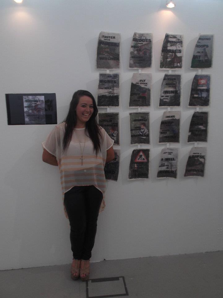
I have decided that in my unit 7 work, I am going to look at typography and how type can be a thing of visual beauty as well as a way to narrate your work. I want to explore the concept of ‘A-Z’. An obvious interpretation of this would be the alphabet, which I intend to look closely at and experiment with different ways to present the letters. I also want to explore the idea of the A-Z being a journey and look at maps and typography in the environment.

Contextual Research
So far in this project my work has been influenced by Peter Blake and Jaume Plensa, who’s work I think embodies the idea of text as an art form in itself. I have also looked at artists such as Barbara Kruger and Mary Kelly. All of these artists have influenced the decision to work with typography. In order to push my research further, I intend to visit gallery’s such as the Liverpool Tate gallery, where there is work by artists such as Liz Buckley and David Kindersley, whose work I am particularly interested in.

Techniques and Presentation
I am going to experiment with a range of materials and methods throughout my FMP, including photography, printmaking and collage. I want to explore different ways of producing type through digital, hand crafted and rendered techniques. I plan to look at text that I have found and experiment with layers and different surfaces. For my final piece I intend to produce piece of graphics that explores the concept of typography as an art form.

Evaluation and Progression
Throughout my FMP I will have regular one on one talks with my tutors to reflect on what I have done, what has worked and what has not and what I can do to continue. I will also use my blog to record any changes in my ideas and why they have occurred, as well as any comments from peers or tutors. At the end of my project I will assess the final outcome against my original intentions and consider the reactions of other people for my final evaluation.  

Friday, 13 April 2012

Contextual Research

Since my pitch have been doing research on the artists that were suggested by my tutors as well as other artists that I have found and liked.
I have researched all of the 5 artists that Kim and Jamie suggested I look at and have found that I really like the work by both Barbara Krugar and Mary Kelly.

'Four Works In dialogue'-Mary Kelly
I was inspired by this piece in particular and the way she uses reflection and lighting to create the illusion of a continuous loop of writing.
 
'Past/Present/Future'-Barbara Kruger
I really like all of the work by Barbara Kruger but this piece really court my eye. I think that the text speaks really loudly to the spectator and the variation in the size of the text almost gives the impression of multiple voices speaking to you. I really like the minimalist colour sceme and think this adds to the dramatic nature of the instillation.

Thursday, 12 April 2012

Pitch Feedback

Today I pitch my ideas to two fo my tutors, Jamie and Kim, and they said that I should go with idea 2 (typography as an art form). This is what I was expecting because it is a bit less defined and there is more room for experimentation.
Before I did my pitch I was extremely nervous as I am not very confident when it comes to talking to an audience, however I actually found it really usefull because it gave me a chance to talk through my ideas and get other peoples opinions on them.
After I had pitched my ideas and we had spoken about which ideas were best, my tutors suggested that I create a blog to go along with my scetchbooks and journal which I have now done. They also gave me some possible artists to look at.
These are:
  • Jasper Johns
  • David Shrigley
  • Derek Jarman
  • Mary Kelly
  • Barbara Kruger

Pitch Preparation

These are some notes that I made too take into the pitch with me to help back up my ideas.

Feedback

On 21st March I spoke to Jo about my pitch and she gave me some things to think about.

Idea 1
  • Demographic
  • Purpose
  • Influences
  • Examples of magazines already on the market
Idea 2
  • Typography as an art form
  • Timeline of type
  • Modern type
  • Different fonts
  • How technology has effected typography

Research

On 14th march I went to the library to do some research and find some artists that would inspire me and my ideas. These are the notes that I took.


 After I had been to the libraray I researched some of the artists that I had writen down. This was on of my favourites. Its a page from Lewis Caroll's 'Alice in Wonderland'. I like how he thinks about the way the story looks and how he uses the text to actually illustrate his novels instead of just telling the story.
 I also really like this piece from The Face Magazine by Neville Brody. Its a very different and modern way to present the text.

mind map of ideas

I did this mind map to explore a few ideas that I was considering for my FMP. From doing this I came up with two ideas to put forward for my proposal. The first idea is to look at magazine layouts and the second idea is to explore the idea 'typography as an art form'.

Introduction

I have started this blog today because I think it will be areally good way to record the creative process behind my work. I intend to work on this blog aswell as in my scetchbooks and in my journal. I will start this process by uploading and posting my previous journal entries and then from now on I will try to use this blog as evidence to back up the work I do in my scetchbook.